
There’s nothing worse than something that auto-renews unexpectedly. Or finding yourself stuck in a website pattern that just doesn’t do what you want to expect.
These are deceptive patterns – user experience tricks and methods that force users into something unintended. It can include visual elements, interactivity, audio, motion, hidden sales, and more. And although commonly used, they are a bad idea.
Here’s how to avoid using deceptive patterns in website design, and some tips on better approaches to take!
Be Clear with Data Usage
Data protection is a big buzzword, but are you really taking care of personal information if users share it with you? Often those screens that help us opt into services include questions that are unclear at best and deceptive at worst.
Think of the last app you downloaded. It probably read something like the one from the popular app TikTok:
“Confirm you are above 18 and allow personalized ads: Are you over 18 and do you allow TikTok to show personalized ads? To learn more, read our Terms of Service and Privacy Policy. No/Yes”
You are probably used to seeing notices like this everywhere. But the consent asks two questions and only allows for one answer, making it deceptive. Are you answering yes to the fact that you are over 18 or for personalized ads?
Here’s how you avoid this: For all places where an answer is required, only ask one question. Structure consent as one element one checkbox or answer. This might mean you have to include multiple consent authorizations.
Products Should Never Sneak into the Cart
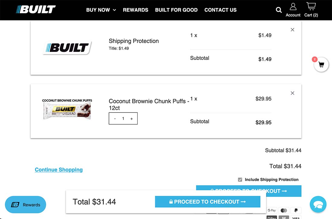
Products should never show up in a shopping cart without the user putting them there. Quite a few retailers are adding elements that increase the cost – often by incremental amounts – in hopes that you don’t notice.
Look at the example above. The product was all that I put in the cart. But it automatically adds shipping protection (what is that?) and the check box to remove it is tiny and hidden with other buttons. (Note the “x” on that product will not remove it from the cart; the only way to remove it is to unselect the checkbox before clicking proceed to checkout.
The solution here is easy. Don’t do it. Don’t sneak any type of item that incurs an additional charge into the cart. If you want to offer something else, a user must opt in. No boxes should be preselected at checkout.
Charges Should Come with a Notification
When you sign up for a free trial and enter payment information, it’s time to be aware of potential deception. Will that service charge you or renew without letting you know? What’s the cancellation policy?
This is a double-up on deceptions:
You may be charged on a specific renewal date without prior warning or the opportunity to cancel.When you choose to cancel, there’s no refund and you have to pay until that term ends. (So if you cancel the day after the surprise renewal, you won’t get a refund.)
The good news is there are even more ways to avoid this deceptive user pattern:
Send at least one notification before a free trial ends. A best practice is to send a notification a month before expiration and again a week before. Let the user know what they will be charged, what for, and when. Provide a method to cancel.Make cancellation clear and easy. If you can sign up online; you should be able to cancel as well. Don’t hide this information.Provide a cancellation link with all correspondence that includes payment.Make sure all buttons and links are clearly labeled and easy to understand. The button should explain exactly what it does.
Let’s Stop Confirmshaming
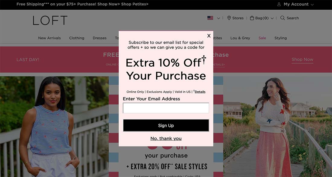
This is probably one of the most common deceptive patterns out there. It is so widely used that you probably already know that you’ll want to click the small text link rather than the button when you see it.
Confirmshaming tricks users into foregoing a promotion or deal because they are opting out of opting in. The pattern makes them feel guilty for not taking part in the offer.
In the example above, a user has to provide an email address to get the offer. The button is available for this confirmation only. To opt-out, you must click the no, thank you text link.
Some examples of this practice use even more shaming in the text such as “No, I don’t want to save money.”
Avoiding this pattern is all about the wording. Think about how you phrase opt-in and button microcopy. The opt-out should not be hidden or difficult to find.
No More False Urgency or Scarcity, Please
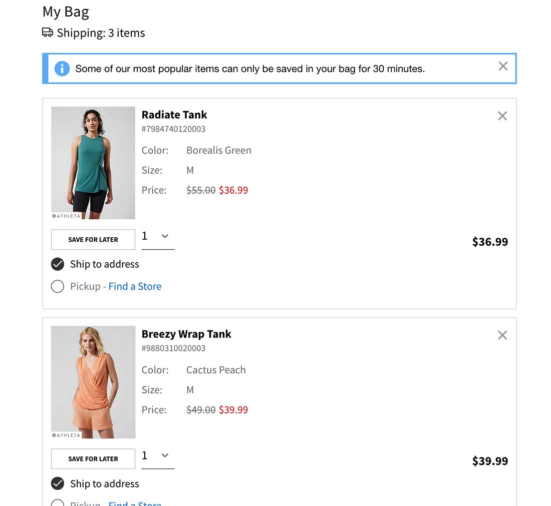
This is another shopping pattern that will make you miserable. When you look at an item it tells you there’s a limited quantity or that your cart can only hold the item for a few minutes.
This forced urgency in shopping is stressful for customers and for what good? If someone makes a purchase too quickly, will it get returned? What’s the value?
Then there’s the question of adding available inventory to the equation. Does seeing that there’s only one item left impact your buying decision? Or does it feel ingenuine?
The solution here is one of accurate information. If you have deployed these tactics as part of the design to force sales, it’s time to stop. If you are providing true and accurate information, these elements could potentially be valuable.
But here’s what not to do: Note the disclaimer that the items can only be held in the cart for 30 minutes above. Here’s the reality, those items have been in my cart for 5 days. That’s a deceptive pattern, not helpful information.
Conclusion
While using a deceptive pattern might get to you a goal outcome quickly, it will likely result in user frustration in the long run. You don’t want to design something that is intended to trick users. There’s almost always a better way.
You also don’t want to inadvertently design these patterns because you see them commonly used elsewhere. Take care to avoid deceptive interactions and patterns to ensure that your website design is credible and creates a positive user experience.
By: Carrie Cousins
Title: 5 Tips to Avoid Deceptive Patterns in Website Design
Sourced From: designshack.net/articles/ux-design/deceptive-patterns-in-website-design/
Published Date: Mon, 11 Jul 2022 08:00:48 +0000
Did you miss our previous article…
https://www.webdesignhawks.com/?p=4533