A high-color design can be a difficult thing to create without the final design feeling overwhelming. But designers are taking this chance and experimenting with a bit of color overload to create stunning projects that don’t overwhelm users.
Here, we’ll look at 10 different examples with 10 tips to help you navigate this color trend as you complete a website or other design project.
Leave the muted color palette behind, and dive into a world of vivid color!
1. Balance Color with White
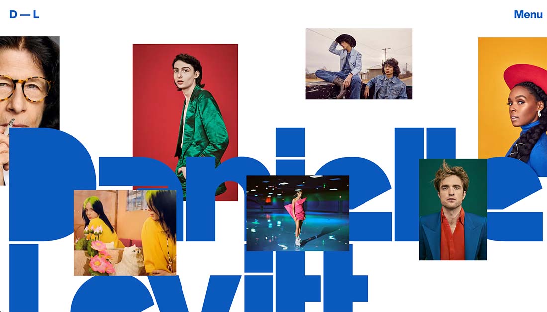
When you are working with bold colors or lots of hues, it is important to create a counter-balance for the design. A back background or area to offset all that color can hit just the right note.
White allows your color to flourish without getting in the way. It also keeps the design from getting too in your face with bright hues.
In the example above, there’s a lot going on, but the white background really helps pull everything together. Note the use of space as well so that the white areas on the screen – even with the motion and oversized headline – are almost equally weighted to the color and filled spaces.
This balanced element keeps the design interesting without being overwhelming.
2. Be Bold
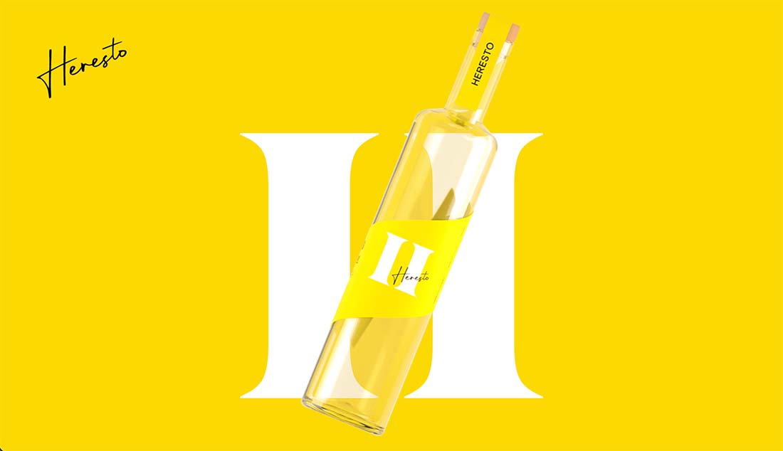
When you want to use color, sometimes the option that makes the most sense is a bold one. A stunning hue with a sharp image element can create a striking combination that demands attention.
Pick a super bright color (preferably from your brand palette) and go for it.
The brightness and bold nature of the color will grab your attention and draw you into the design. Pair it with simple imagery, such as in the example above, to really maximize the impact of color.
3. Balance With Imagery
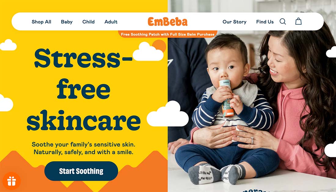
When you want to use color but not get too crazy, a split screen option with an image to balance the hues can be a solid option.
The secret to making this concept work is picking colors and an image that works in concert. They have to feel somewhat equally weighted and the colors in the image and paired design elements have to have a common look at feel.
That doesn’t mean the colors have to be the same, but they do need to work together.
In the example above, what really makes the bright color on the left work with the image on the right is the navy color theme. Note how it is used for the text and is the same color as the baby’s clothing in the image on the right.
4. Go Mono(tone)
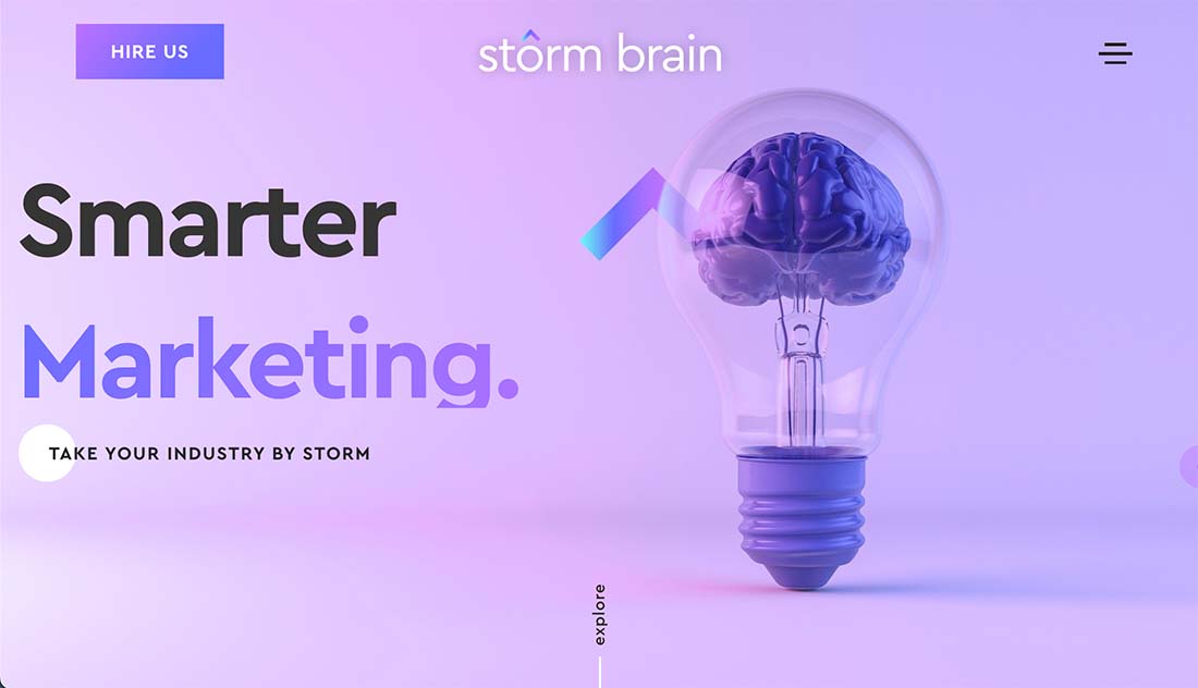
When you want to use color in a big way, consider a monotone palette to help you use bold or bright options that don’t turn into a garish mess.
Multiple tints and tones of the same base color can feel elegant and impactful. Take it to the next level with imagery that also uses the same colors for a super-consistent design, like the example above.
5. Include an Overlay
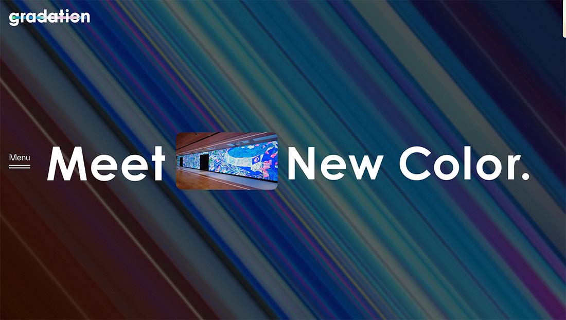
When you use a lot of color but are concerned that it is too much, an overlay can help.
Use a black or white overlay to soften the brightness of color and moderate variations in hues to ensure you have a place to put text that has enough contrast for readability.
The example above does a great job with a bright color background that includes an overlay plus a video element that uses similar colors without the overlay. The combination is visually appealing and has a color of color without feeling overwhelming.
6. Use Color for Eye Tracking

A combination of colors for user interface elements can help drive users to key elements on the screen. This eye-tracking technique helps move users from large elements such as images to text or calls to action.
And it is all rooted in contrast.
The area of interest should be vastly different than the background or primary visual element.
In the example above, a dark background is countered by big white and bright-colored text to draw the user’s eyes to the words and actionable elements on the screen.
7. Use Color in Images
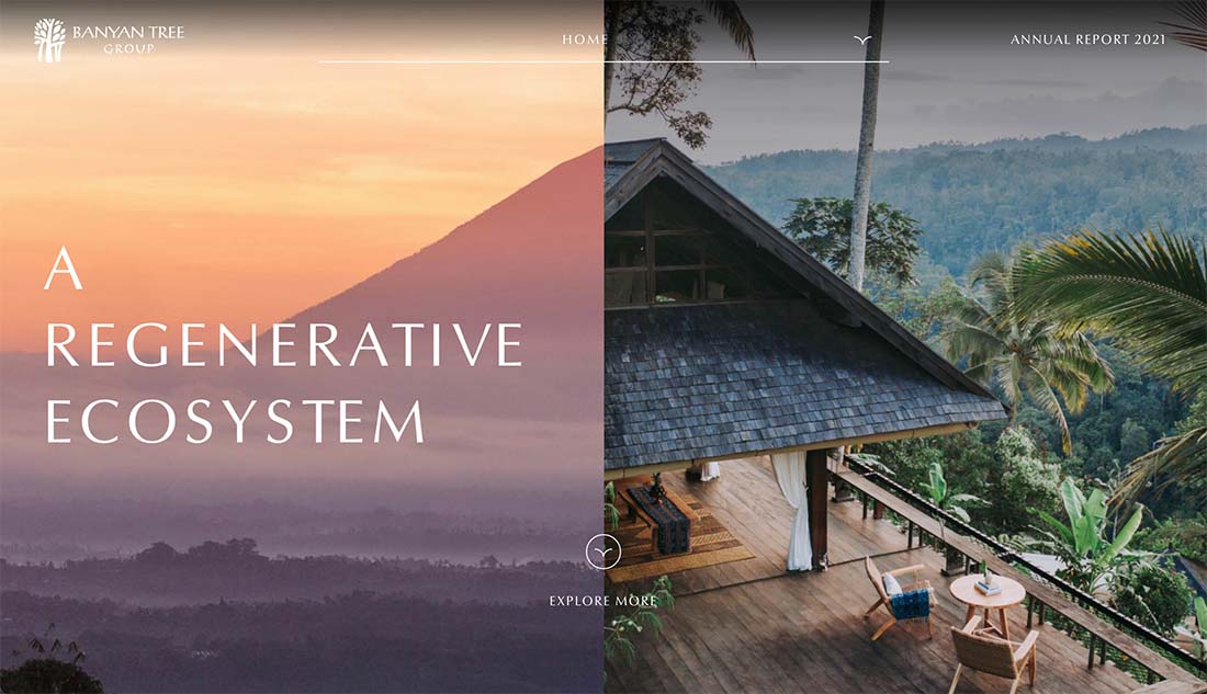
High-color images are a great tool to design a project with a lot of color without having to create additional elements. You have the foundation for a simple but colorful design with the right imagery.
When thinking about high-color images, you have a few choices:
Work with the photographer to design the photoshoot in the style you are looking forEdit photos for high contrast and color or apply filtersStage a photo display for exactly what you want (this works great for products, but not as well for environmental images
8. Design an Effect
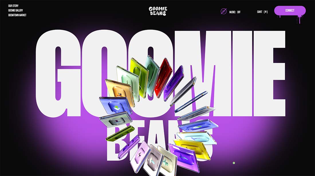
Use high color as an accent or effect to break up a design or help users better understand the content. This is a popular concept when thinking about how to use a rainbow of color options in a way that doesn’t get in the way of content.
In the example above, the whirling product image includes variations in lots of colors. There’s a rainbow effect, but it doesn’t overtake the screen or distract you from what you are supposed to take away from the design.
This is a popular choice with product promotion and the use of high color design aesthetics.
9. Stack Color in Layers
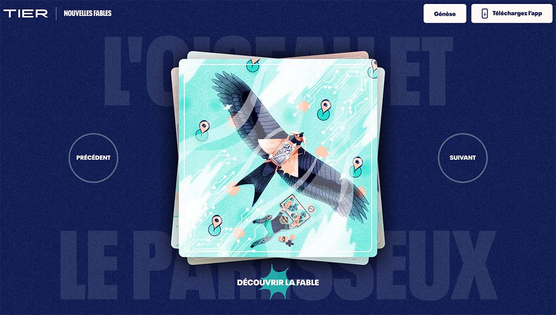
High color designs can benefit from layering to establish an organization and a place for all the color choices therein.
It starts with a background that works with a top layer that includes a colorful element.
In the example above, these layers set the stage for click actions where the top layer becomes the primary image. It works because the initial layering gets you ready for the full-screen activity that’s about to happen.
It also helps the user understand the content in a more comprehensive way. Color is used to facilitate reading and understanding before the full website experience begins.
10. Unapologetically Go All In
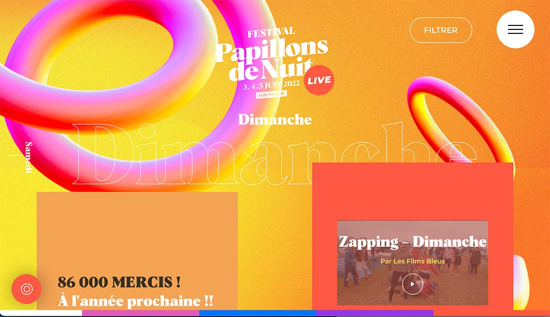
If you are willing to take a risk with color, just go all in. Use color to the boldest and most extravagant extent to get your message across.
Keep in mind this can be something that users can love … or hate. That much color can lead to varying emotional connections.
Look at the example above: How does it make you feel? That’s the risk associated with going all in on high color. You need to set the right tone and strike the right chord at the same time with your key audiences.
Conclusion
One extra tip: When you go all-in on a trend like this, make sure that the color works with your palette. If you get too far from your brand colors, you can lose a vital connection with users.
It’s important to stay true to your identity when experimenting with design elements such as this. If your palette doesn’t work in a super-colorful style, it might be best to try something else and save this idea for another project.
By: Carrie Cousins
Title: Color Overload: 10 Tips for Creating Color-Packed Designs
Sourced From: designshack.net/articles/trends/tips-for-creating-color-packed-designs/
Published Date: Thu, 11 Aug 2022 18:00:16 +0000
Did you miss our previous article…
https://www.webdesignhawks.com/?p=6691

