When you combine typography and animation, you get kinetic type. This website design trend is showing up practically everywhere as designers add motion to text elements to create more engaging headlines and art elements.
It’s an engaging way to take typography to the next level, bringing it alive on-screen.
Here, we’ll take a look at the kinetic typography design trend, what it is, and how to make it work for you. Plus, examples and a few downloadable to help you get started.
What is Kinetic Typography?

Even if you don’t know the term “kinetic typography,” you probably know exactly what it is. This technique has become wildly popular in everything from web design to online ads to commercials to social media.
Kinetic typography features animated text elements that help grab attention and create the tone for a project. It can be wildly impactful and add an artistic flair to projects.
The challenges are that it does take some animating skills to create and there’s a fine line between great kinetic type and moving text that falls flat or is a complete distraction from the design. (Thankfully, for you, there are some tips below on how to use this trend well.)
How to Identify the Kinetic Type Design Trend
Identifying kinetic typography is easy: It’s practically any text element that includes motion. It can zoom, pinch, spin, scale, anything!
In a nutshell, all kinetic typography really means is moving text.
5 Tips for Using this Design Trend Well
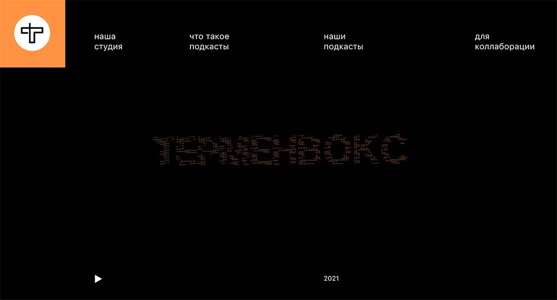
The key to making kinetic typography work is to use it well. Motion can be complex and the wrong animated timing or action with the wrong typeface and you’ll end up with a disaster. You need to consider the font choice and the motion you plan to incorporate for the greatest success.
Here are a few ideas for doing just that.
Choose an easy-to-read typeface: A complicated typeface can go from interesting to unreadable when you add motion. It’s important to start with a highly readable typeface to facilitate readability an animation is added.Use smooth, consistent motion: Jumpy animations with lots of starts and stops are more difficult to comprehend than simple, seamless motions. The animation should flow in a never-ending loop that gives the user time to read the words on screen.Amp up the contrast: The background and foreground elements need to be clear in almost all instances, but the addition of animation, makes them even more important. A high level of contrast will help readability when there are multiple layers of effects working in concert.Use other elements wisely: Kinetic typography does not have to stand alone. Combine moving text with images, illustrations, or shapes as part of an overall visual display. Set up the design so that there’s a mix of static and dynamic elements with balance.Consider the audience: Everything from speed to color to font selection is important based on your target audience. This is especially true for kinetic typography, where you need to ensure your audience is welcome to, and understands, the technique and user experience your design will display. Otherwise, all your work has been for naught.
5 Examples of Kinetic Typography We Love
Looking for a little kinetic typography inspiration? Click through these examples to see how each one uses moving text in a different way.
Lusil Blek
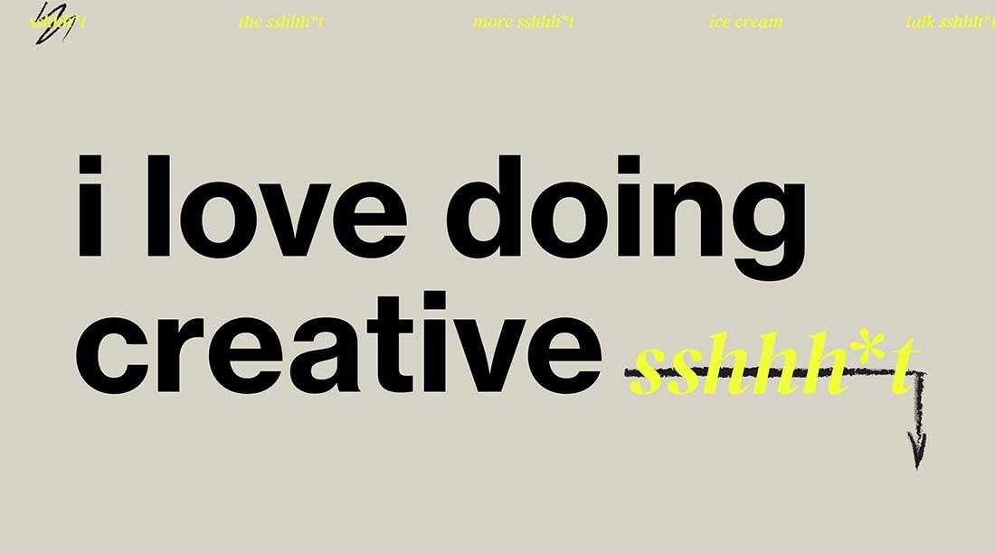
Go simple and small with kinetic typography with a single character motion, such as the one for this portfolio site.
Max
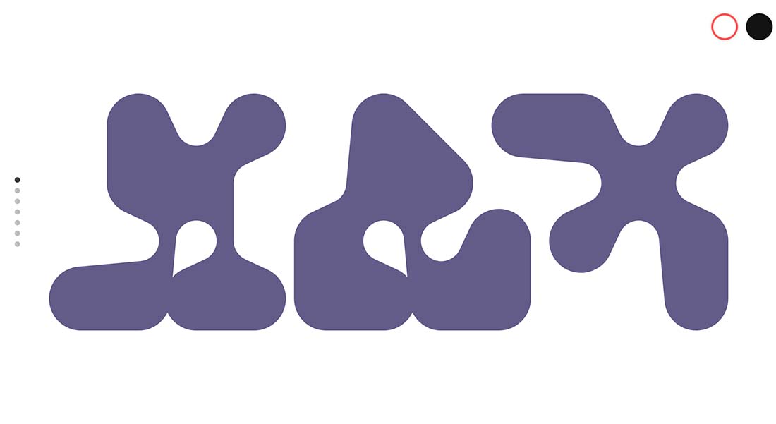
This design for a kinetic typeface is so mesmerizing that you might find yourself looking at it all day.
Future London Academy

There are multiple levels of kinetic type happening in this design with an oversized, white back layer of text with a top layer of moving black text that’s highly readable.
Swaychain
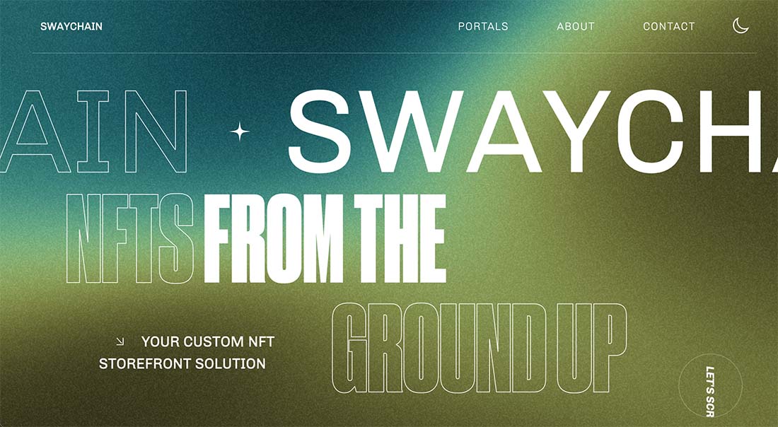
This super trendy option includes a text scroll at the top of the hero image and a secondary kinetic type element in the bottom corner. The combination is a lot to look at, but visually interesting.
Google Doodle

Google Doodles might be the most well-known, and well-executed example of kinetic typography you’ll find. Explore their library.
5 Cool Kinetic Typography Templates
If you need a kinetic typography element or template, there are plenty of options out there. Envato Elements is a good place to start with a collection of more than 3,500 options in the video template gallery alone.
The great thing about templates is that you can choose one that includes a text style you already like and just make adjustments to help incorporate it into your design, such as changes to color or font. The basic timing and animated elements are already there.
The other bonus to working with a template – particularly a high-quality template like these examples – is that you can use them to help you better understand how to create these elements on your own from examples that already do it well.
When choosing a template, download something that has all the design elements you need in a style you like. Also, make sure to look for a template that uses software you are comfortable with. Many of these templates are available for multiple software elements, but you should check before downloading for compatibility to make your workflow as simple as possible.
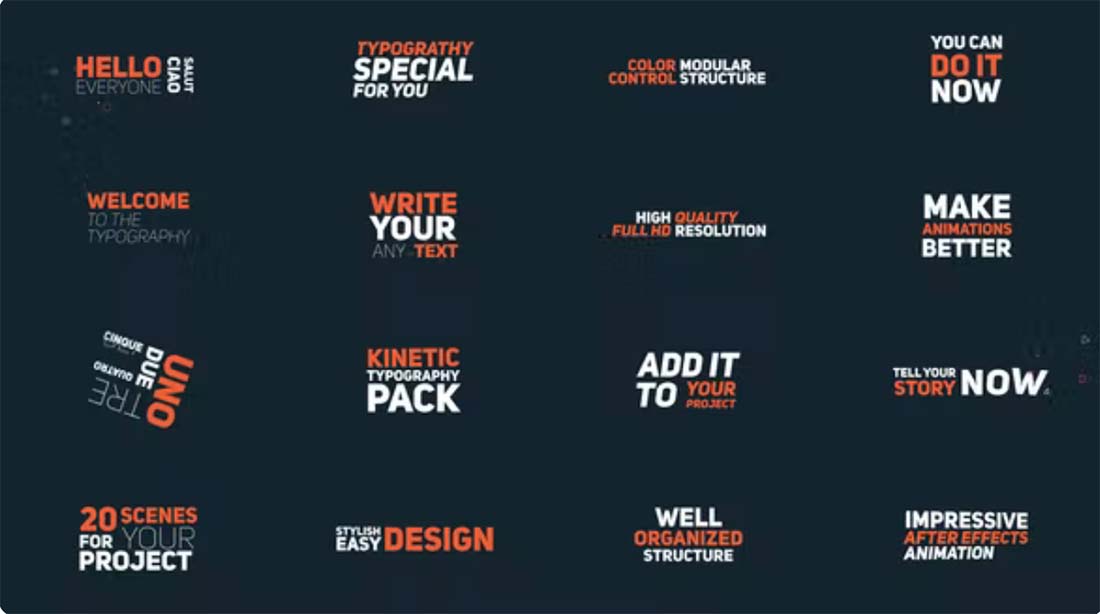
Kinetic Typography
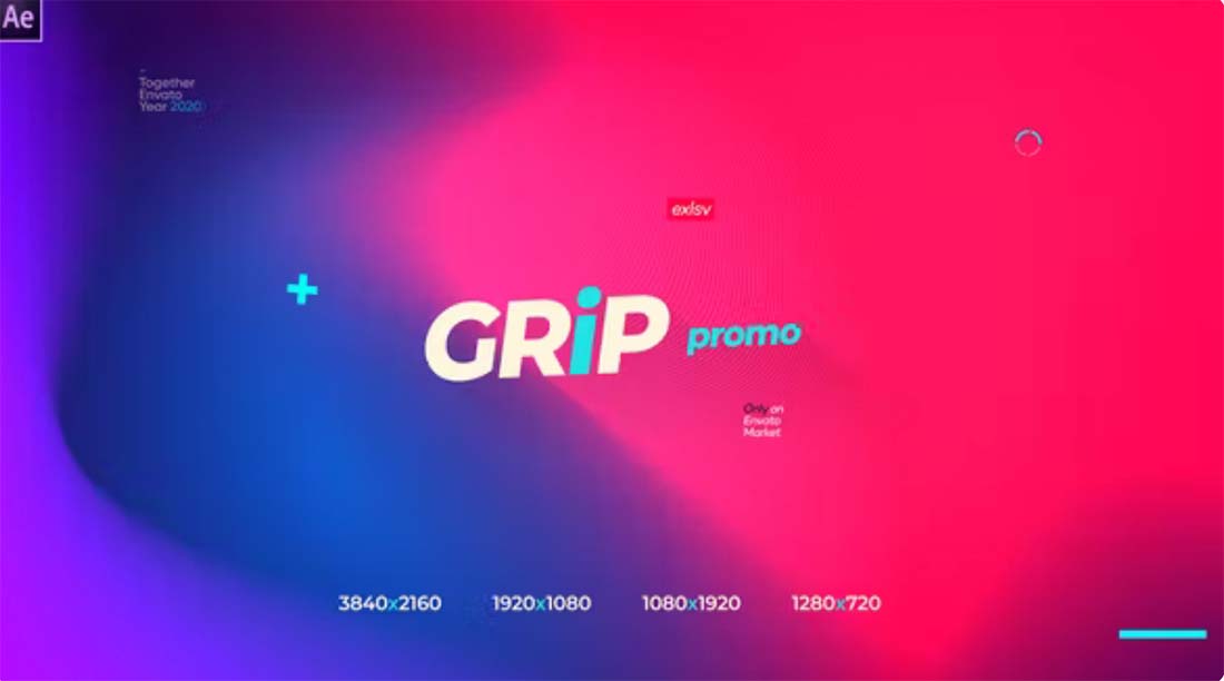
Grip Promo
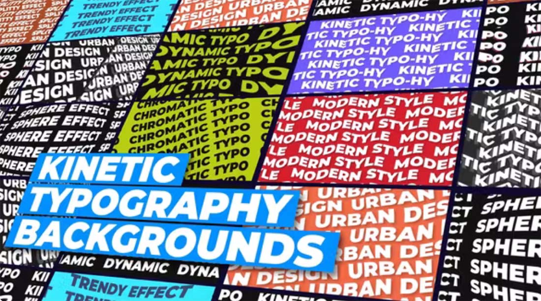
Kinetic Typography Backgrounds
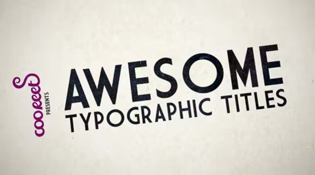
HD Kinetic Typography
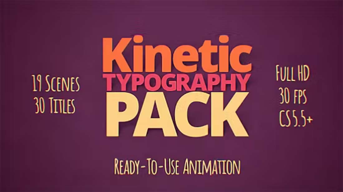
Kinetic Typography Pack
Conclusion
Kinetic typography is a fun, interesting element that can contribute to an overall design theme. It’s also one of those trends that you can put with almost anything. Have fun!
By: Carrie Cousins
Title: Kinetic Typography: An Eye Catching Font Trend
Sourced From: designshack.net/articles/trends/kinetic-typography/
Published Date: Thu, 18 Aug 2022 13:00:42 +0000
Did you miss our previous article…
https://www.webdesignhawks.com/?p=7139

